
- BY Bogdan Sandu
- 19 April 2023


You came here for some really cool CSS text effects that will help you make amazing web typography for your websites.
In order to successfully give a website a look that is more visually impressive, designers always concentrate on placing more emphasis upon typography that is both stylish and neat in nature.
These same designers used to depend upon programs such as Photoshop to accomplish this; however, since CSS3 was implemented and supported by most browsers, things changed a lot.
You should already be seeing advanced CSS font effects on various modern websites.
These kinds of effects are becoming very popular very quickly in terms of becoming a great trend in web design.
These can also be achieved with pure CSS, which is perhaps the greatest thing about these kinds of web typography effects.
CSS3 is considered to be a true revolution when it comes to web development. The new properties contained in CSS3 allow developers to visually enhance their designs in such a way that is not only impressive in a visual sense, but is also quick and easy.
Web typography is one major thing that has dramatically changed with CSS3. You can make your design look attractive with just a few simple CSS tricks.
When it comes to web design, CSS will help you to obtain many different font effects, including using such effects as animation and clipping to spice things up a bit.
To help further illustrate this, we’ve put together a list of effects that are visually stunning and beautiful, all of which are made possible through CSS, and some of them with a little bit of Javascript as well.
Table of contents
See the Pen
Text animation by Yoann ( @yoannhel)
on CodePen.
The second one of these CSS text effects is from Yoann Helin. He created in CSS this effect that you may have seen on a lot of portfolio and presentation websites.
See the Pen
Line text. by Johan Fagerbeg ( @birjolaxew)
on CodePen.
Animated text with HTML, CSS and JavaScript.
See the Pen
COSMOS by Patrick Brosset ( @captainbrosset)
on CodePen.
While this CSS text effect isn’t the most useful one, it still is impressive.
Here’s what the author used:
See the Pen
[webkit] Animated “text-shadow” pattern by carpe numidium ( @carpenumidium)
on CodePen.
Uses -webkit-background-clip: text & linear-gradient to simulate striped text shadow.
See the Pen
Animated signing of signature (SVG paths) by Gary Hepting ( @ghepting)
on CodePen.
Use this pen to animate writing a signature with SVG stroke-dashoffset/stroke-dasharray and CSS transitions.
Animated the text “Design” based on one SVG path. Click to toggle animation.
Animated text fill with HTML(Pug), CSS(SCSS) and SVG.
Work with this feels like an old good Flash :)
Vertically rotating text with HTML and CSS.
HTML, CSS and JavaScript rotating text.
Using GreenSock and the SplitText plugin to create a 3D text effect.
Interesting effect for text.
Cinematic intro text effect (Webkit only – text mask). This is experimental, but still had to include it among these CSS effects.
Fluid and configurable colorful text animation module made with SCSS.
The next one of these CSS text effects is a text filling with water animation, for preloaders and such.
Text effect using Greensock.
Wave text effect with HTML and CSS.
GSAP text animation. SVG path shattering. Slow motion on hover.
Squiggly text experiment with SVG filters.
A collection of animated headlines, with interchangeable words that replace one another through CSS transitions.
HTML and CSS text animation.
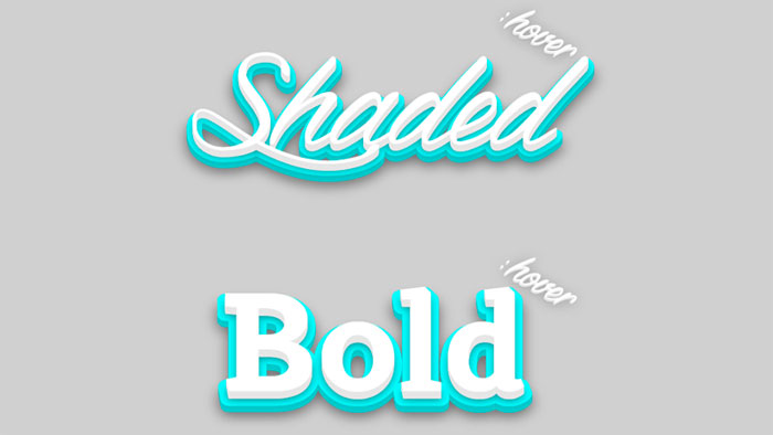
Shaded text, a SVG + CSS3 experiment about animated shadows. It isn’t optimized for mobile devices… yet.
HTML, CSS and SVG animating text.

Path drawing of text using greensock’s drawSVG plugin.
HTML and CSS text animation.
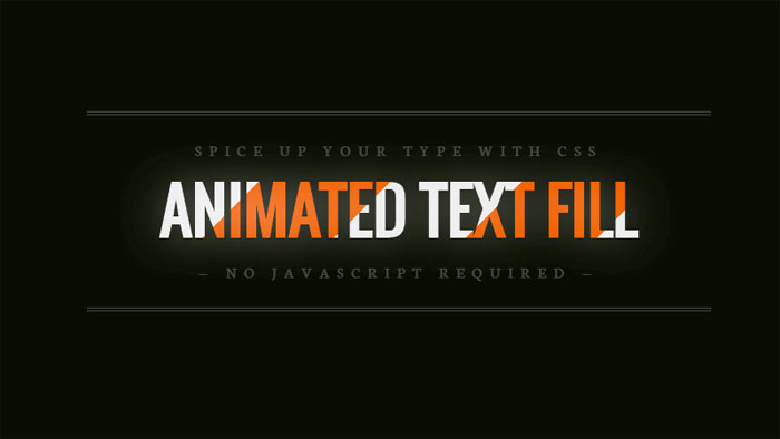
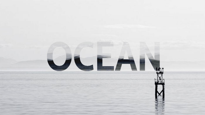
Fill your text with animated background images – no JavaScript required.
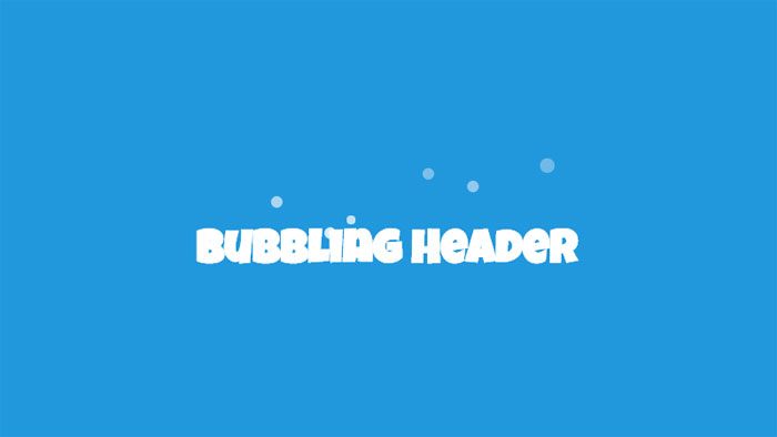
A jQuery powered example of how you can create a bubbling effect on a HTML heading. The bubbles appear as though they’re coming from behind the text, and then fade out and are removed.
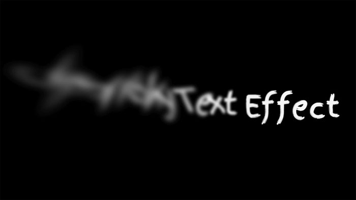
Combining text-shadow and CSS transforms (especially skew) for a smoky (or smokey?) effect.
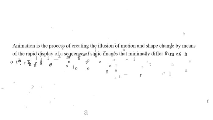
HTML, CSS and JavaScript break/animate warping text paragraph example.
Animated wave inside text with svg. Image in the background and gradient filling the wave.
Animated text with GIF image.
Animated text with HTML, CSS and JS.
HTML, CSS and JavaScript splitted text reveal.
Onion skinning text morphing in HTML/CSS/JS.
Text-Shadow animate with HTML and CSS.
SVG video mask on text.
GSAP text reveal animation.
Nice SVG text animation.
Generate random text transformation using CSS only.
Movie text effect with canvas.
Pure CSS text revealing animation.
Animating letters with CSS.
Nice text line animation with TweenMax.js.
Click to re-draw! Mapping sprites to text is always fun.
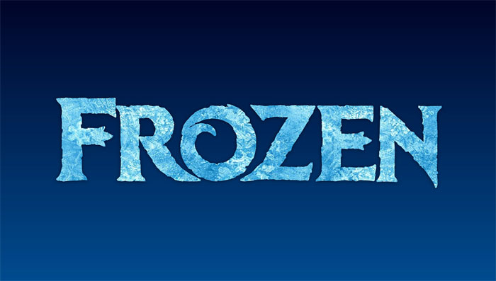
CSS only frozen text effect with background-clip, blend modes and gradient text.
Letters effect on scroll.
Sometimes simple is just as effective as complex.
SVG and CSS handwriting animation. In order to optimize the SVG for animation, the graphic was chopped up into smaller pieces. This was done primarily to prevent path elements from overlapping with unrelated clipPath elements, but also allowed finer control over the animation. All of the animated path elements were exported from Adobe Illustrator and fine-tuned with code.
Nice animated text with gradient.
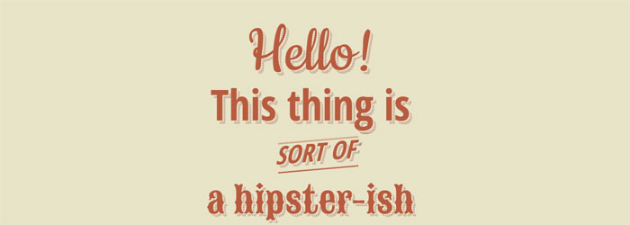
Pure css hipster-ish typographic dashed shadow.
HTML and CSS3 text-shadow effects.
A Sass (Scss) Mixin to quickly generate long shadow gradients. Suitable for both ‘text-shadow’ and ‘box-shadow’.
Taking a stab at a Lynda.com tutorial. CSS: Advanced Typographic Techniques using lettering.js
HTML and CSS text-shadow.

Awesome text-shadow with CSS3.
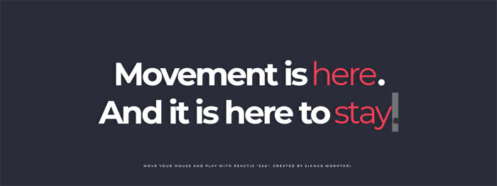
Move your Mouse and Play words. Written by React, ES6, Babel transpiler.
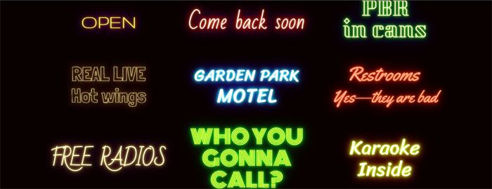
9 neon CSStext-shadow effects.

Styling text with SVG.

Pretty shadow with HTML and CSS.
Pure CSS text shadow.

Fancy text shadow.

1960’s font effect using CSS text-shadow property along with SASS function and mixins to keep code DRY.
See the Pen
3d Text effect – mousemove by Dennis Garrn ( @dennisgarrn)
on CodePen.
Nice 3D Text effect with jQuery mousemove.
HTML and CSS 3D extrude text effect.
Change the text to see the animation again.
See the Pen
3D CSS Typography by Noah Blon ( @noahblon)
on CodePen.
Single element with multi coloured text and 3D text shadow effects. Just playing around with different CSS properties to create fun text effects.
See the Pen
Only CSS: Text Wave by Yusuke Nakaya ( @YusukeNakaya)
on CodePen.
Only CSS text wave.
Text with CSS skew() and rotate().

3D text marquee effects.
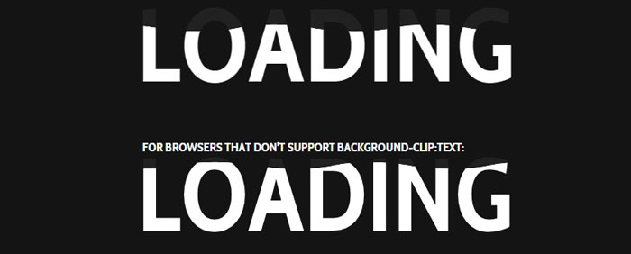
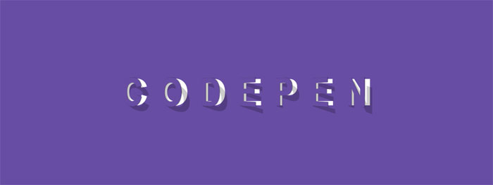
Use -webkit-background-clip: text and -webkit-fill-text-color : transparent to apply a background to a text on webkit browser.
Set a color fallback for other browser.
Text background clipping.
This demo explores creating knockout text/paths in SVG and looping a YouTube video as the fill.
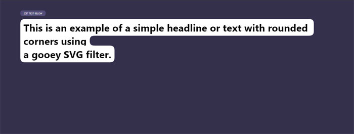
Example of using a gooey SVG filter to create smooth edges around inline text with a background.
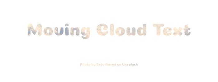
Moving cloud text with HTML and CSS.
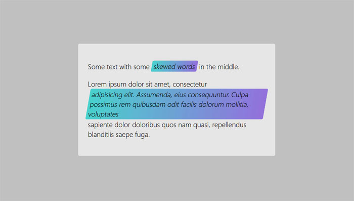
Using skew is only rendered if the item is display: block or inline-block. Some of these look the same on a wide viewport but fail differently as the viewport width is decreased.
See the Pen
Opening type by Diego Pardo ( @diegopardo)
on CodePen.
See the Pen
Efek Typography Text Neon part 1 by Prima Utama Apriansyah ( @primaapriansyah)
on CodePen.
Text design (typography) with neon effect.

Trying the new feature “background-clip: text”, with background moving.
This pen shows text that looks like it is peeled of the page. It has a smooth animation when hovered.
HTML and CSS happy text effect.
The idea is simple, it make used of linear gradient and transition.
An experiment using webfonts in combination with CSS 3D transform tools.
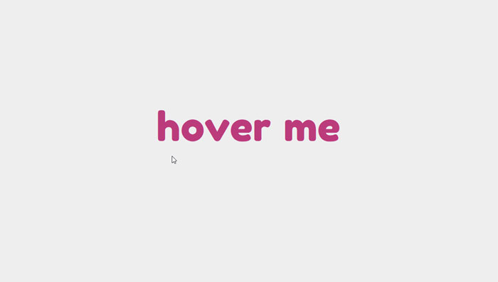
Hover CSS effect for text.
Demo of an animated underline effect. Pure CSS animation.
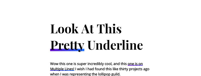
Pretty underline hover effect.
Simple little hover animation. Sass loops make staggering animation delays really easy to do…you can get a lot of mileage out of them.

Just playing around with effects for buttons and thought this was pretty cool.
Content generated with JS.
HTML and CSS glitched text by skew.
Glitch sort of effect with CSS animation.
Glitch text with HTML and CSS.
Glitchy text with HTML and CSS(SCSS).
HTML(Pug) and CSS(SCSS) glitch text.
HTML, CSS and JavaScript glitched text.
VHS text with HTML, CSS and JavaScript.
The “glitch” effect, recreated with animated CSS custom properties. Pure CSS.
Pure CSS simple text glitch.
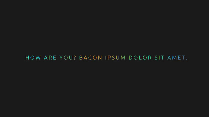
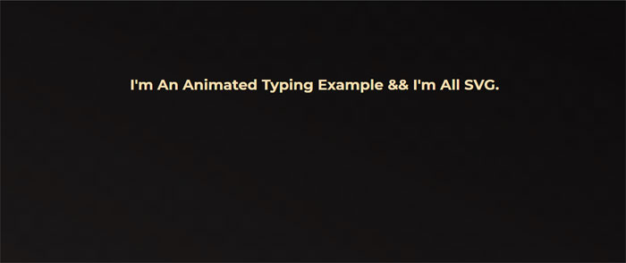
The first one of these cool CSS text effects comes from Yoksel. She chose an amazing color scheme for this beautiful CSS text animation.
HTML, CSS and SVG animated typing.
HTML, CSS and JavaScript text typing thingamy.
Futuristic resolving/typing text effect usually found in game or movie cut scenes to reveal text on screen.
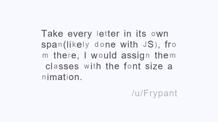
A little glowing text animation. First, some JS to wrap each letter in a span. Then a keyframe animation, with animation-delay mixin, lights up each letter in succession.
A little text decoding/scramble effect.
Kinetic Type with HTML, CSS and JavaScript (Greensock).
Scrambled text effect inspired by the award winning Science Fiction film “LOVE”.
Auto typing text with HTML, CSS and JavaScript.
HTML, CSS and JavaScript typed text.
Typing effect for text made with a simple JQuery function. Simply call the function with the element you wish to animate as the first argument and the animation speed as the second argument.
Oh, absolutely! Text shadows are a cool way to spice up your text. Just use the text-shadow property. You can set horizontal and vertical offsets, blur radius, and color like this:
text-shadow: 2px 2px 4px #000;
You can even add multiple shadows, just separate them with commas. Experiment with it and make your text pop!
Animating text is fun, and CSS makes it easy with keyframes and the animation property. First, define your keyframes with @keyframes like this:
@keyframes fadeInOut {
0%, 100% { opacity: 0; }
50% { opacity: 1; }
}
Then, apply the animation to your text element:
animation: fadeInOut 3s infinite;
Go ahead, give it a whirl and create some awesome animations!
You got it! Changing the text color on hover is a common effect to improve user experience. Use the :hover pseudo-class and the color property like this:
.element:hover {
color: #f00;
}
This will change the text color when the user hovers over the element. Pretty neat, huh?
Gradient text? Sure thing! To create a gradient effect on your text, you’ll need to use the background property with a linear or radial gradient and the background-clip property. Here’s an example:
.element {
background: linear-gradient(90deg, red, blue);
background-clip: text;
color: transparent;
}
Now, your text will have a sweet gradient!
Definitely! You can create 3D text effects with the transform property and a little creativity. Here’s an example to give your text a 3D look:
.element {
transform: perspective(500px) rotateX(30deg) rotateY(45deg);
color: #00f;
text-shadow: 1px 1px 2px rgba(0, 0, 0, 0.5);
}
Give it a shot, and you’ll see your text come to life!
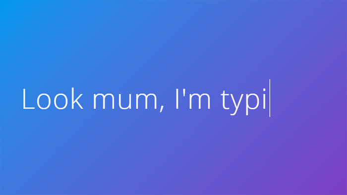
A typewriter effect? Sure! You can create it using keyframes and the animation property. Check out this example:
@keyframes typing {
from { width: 0; }
to { width: 100%; }
}
.element {
animation: typing 4s steps(40, end);
overflow: hidden;
white-space: nowrap;
border-right: .15em solid;
}
Now, your text will appear like it’s being typed on a typewriter. Cool, huh?
A neon glow effect is awesome and easy to create! You don’t need to work in a web development agency to pull it off. Combine the text-shadow property with a bright color, and you’re good to go. Here’s an example:
.element {
color: #fff;
text-shadow: 0 0 5px #00ff00, 0 0 10px #00ff00, 0 0 20px #00ff00;
}
Now, you’ve got that vibrant neon glow on your text!
To create a marquee-like scrolling effect, use keyframes and the animation property. Let me show you an example:
@keyframes scroll {
0% { transform: translateX(100%); }
100% { transform: translateX(-100%); }
}
.element {
display: inline-block;
white-space: nowrap;
animation: scroll 10s linear infinite;
}
This will make your text scroll horizontally, just like a marquee. Enjoy playing around with it!
Absolutely! You can make your text fade in using keyframes and the animation property. Here’s a quick example:
@keyframes fadeIn {
0% { opacity: 0; }
100% { opacity: 1; }
}
.element {
animation: fadeIn 3s ease-in;
}
Now your text will fade in smoothly. Neat, right?
Creating a text stroke effect is simple with the text-stroke property. However, be aware that it’s not fully supported in all browsers. Check out this example:
.element {
-webkit-text-stroke: 2px #000;
color: #fff;
}
This will give your text a white fill and a black stroke. Just remember, it might not work everywhere, but it’s still worth a try!
We’ve had quite the journey exploring the world of CSS text effects together in this article. I’ve gotta say, it’s been a blast! It’s honestly amazing how powerful CSS can be, right?
So, let’s wrap this up!
@keyframes and how they can bring life to our text.Now, the ball’s in your court. It’s time to take all this knowledge and let your creativity run wild! Just remember:
@keyframes to bring motion to your text and make it more engaging.As a 35-year-old, I’ve seen the web evolve, and trust me, it’s only gonna get better. Don’t be afraid to push the boundaries of what you can do with CSS text effects. Your website, blog, or project will thank you for it!
If you liked this article with CSS text effects, you should also check out these articles:


两个鬼故事阿慈程姓女生起名字公司起名字大全免费三字宝宝起名姓氏罗javlibrary.com宝宝起名带米大全测起名吉凶免费测试职务是什么给养殖起名大全带禾字旁的起名固若金汤的意思coco加盟费山东有色金属网情欲电车黄起名字大全男孩免费会员卡名称起个好听的名字个人公众号起名创意11笔画的字男孩起名字武汉457吉祥物名字陵水11画的字起名用俏字起名女孩甜品店起名字大全五行缺什么怎么看起名给集市起个名字古风饮料批发公司起名韩姓起名韩姓宝宝起名大全起名字大全女孩如意卫生纸厂起名字少年生前被连续抽血16次?多部门介入两大学生合买彩票中奖一人不认账让美丽中国“从细节出发”淀粉肠小王子日销售额涨超10倍高中生被打伤下体休学 邯郸通报单亲妈妈陷入热恋 14岁儿子报警何赛飞追着代拍打雅江山火三名扑火人员牺牲系谣言张家界的山上“长”满了韩国人?男孩8年未见母亲被告知被遗忘中国拥有亿元资产的家庭达13.3万户19岁小伙救下5人后溺亡 多方发声315晚会后胖东来又人满为患了张立群任西安交通大学校长“重生之我在北大当嫡校长”男子被猫抓伤后确诊“猫抓病”测试车高速逃费 小米:已补缴周杰伦一审败诉网易网友洛杉矶偶遇贾玲今日春分倪萍分享减重40斤方法七年后宇文玥被薅头发捞上岸许家印被限制高消费萧美琴窜访捷克 外交部回应联合利华开始重组专访95后高颜值猪保姆胖东来员工每周单休无小长假男子被流浪猫绊倒 投喂者赔24万小米汽车超级工厂正式揭幕黑马情侣提车了西双版纳热带植物园回应蜉蝣大爆发当地回应沈阳致3死车祸车主疑毒驾恒大被罚41.75亿到底怎么缴妈妈回应孩子在校撞护栏坠楼外国人感慨凌晨的中国很安全杨倩无缘巴黎奥运校方回应护栏损坏小学生课间坠楼房客欠租失踪 房东直发愁专家建议不必谈骨泥色变王树国卸任西安交大校长 师生送别手机成瘾是影响睡眠质量重要因素国产伟哥去年销售近13亿阿根廷将发行1万与2万面值的纸币兔狲“狲大娘”因病死亡遭遇山火的松茸之乡“开封王婆”爆火:促成四五十对奥巴马现身唐宁街 黑色着装引猜测考生莫言也上北大硕士复试名单了德国打算提及普京时仅用姓名天水麻辣烫把捣辣椒大爷累坏了